Welcome to all users! This page is where you can ask StrategyWiki-related questions to the staff and senior community figures, and they will do their best to answer. If you want to raise a topic for discussion (rather than just ask about it), please use the community issues forum instead. New issues are entered here, with the most recent at the bottom of the page. If your question does not pertain to editing StrategyWiki (e.g. asking for hints or game-specific information), please ask on the guide's talk page or on the forums.
Please review the Table of Contents to see if your issue has already been raised; also check the archives (to the right) in case it was discussed some time ago.
To facilitate ease of browsing and replying, please:
- Place your question at the bottom of the list.
- Title the question (by placing the title between equals signs: ==Title==).
- Sign your name and date (by adding four tildes: ~~~~).
Facebook, Google, Twitter "acceptable" advertisements
You know, I love keyboard shortcuts and I use the mouse as little as possible. The new Windows is quite annoying already: many two-buttons shortcuts became "two buttons plus one", and this slows me down a lot. In particular, "Alt+Tab" became "Alt+Tab, then Esc". WTF??? Yesterday I did it wrong in a way that it reset all Firefox settings, including Adblock. The new Adblock is less efficient than the previous, because of the "Acceptable Advertisements" policy.
Now, a series of "colorful squares" appear on the right side of Strategywiki pages (FB, G+, etc; are they called widgets?). Before the time they were there, I did my edit, then press Tab twice or three times, and I could see the preview or save the edit. With those annoying "acceptable advertisements" I have to press tab seven more times! That's annoying. Could it be possible to move them down in the page script, so that they get selected after the preview and save buttons, and not before? Thanks. --Abacos (talk) 22:38, 25 February 2017 (UTC)
- I checked the page script (using Ctrl+U and Ctrl+F). Strange enough, the text area ends on line 236, "Save, preview and differences" are on lines 246-249, whereas the lines about Facebook etc. are already below them, on line 362. I wonder why pressing Tab I pass from the edit area, to the summary line, then through those 7 annoying thingies, and only then I get to the save/preview buttons. --Abacos (talk) 22:53, 25 February 2017 (UTC)
Thank you, Prod. It works great now. --Abacos (talk) 15:08, 27 February 2017 (UTC)
Suggested new infobox parameter: titleimg

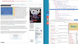
I came across a glitch in some of our page layouts that have a title screen image at the start of the article. Check out Space Quest III: The Pirates of Pestulon for an example of an affected layout. This does not affect {{marquee}} like on Donkey Kong because that does not use CSS' float.
The title screen appears below credits, not because of a header issue, but because we added the social media text box table without combining it into a single div. Since the infobox class has the clear:right attribute, the social media text box table is forced downwards and it starts a new block on the page (forcing all other in-line objects downwards). To get around this, I propose adding a titleimg parameter that would add the thumbnail div between the main infobox and the social media infobox tables. See the image on the right for a highlighted fix (code and layout-wise). Can you find a better fix or propose a different solution? --Notmyhandle (talk • contribs) 05:08, 22 March 2017 (UTC)
- I may have found a superior solution. I wrapped both tables in a div, floated right, and that seemed to do the trick. Anyone have an even better solution before we add it? --Notmyhandle (talk • contribs) 05:16, 22 March 2017 (UTC)
